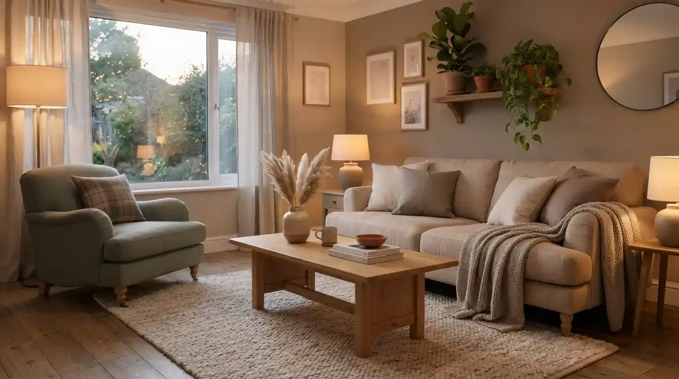
Creating a comfortable home is about more than choosing attractive furniture. Color plays a powerful role in shaping how a room feels, and the right combination of soft neutrals, warm earth tones, gentle pastels, and natural accents can make an interior feel calm, welcoming, and lived-in. The ultimate comfort palette brings these elements together to create spaces that encourage relaxation without looking dull or overly designed.
Whether you are refreshing one room or planning a broader interior update, a thoughtful color palette can provide the foundation for a warmer and more cohesive home. The key is to balance soothing colors with texture, natural materials, appropriate lighting, and personal details.
What Is the Ultimate Comfort Palette?
The ultimate comfort palette is a collection of colors selected to create a relaxed and inviting atmosphere. Instead of relying on one dominant shade, it combines complementary tones that work together across walls, furniture, textiles, accessories, and lighting.
Warm whites, creamy beige, soft taupe, muted green, dusty blue, gentle terracotta, warm gray, and natural wood tones can all contribute to this type of interior. The objective is not to follow a strict color formula but to create visual harmony.
This approach also works well with minimalist living, where carefully selected colors can add warmth without introducing visual clutter.
Why Color Matters for Interior Comfort
Color affects the visual character of a room. Bright, highly saturated shades can create energy and contrast, while muted and warm tones often produce a quieter appearance. For rooms intended for rest and relaxation, a softer palette can help establish the atmosphere you want.
Color also influences how different design elements relate to one another. A neutral wall can provide a backdrop for textured furniture, while earthy accents can connect wood, fabric, plants, and decorative objects.
If your home feels visually busy, combining a restrained palette with practical interior hacks for compact homes can make the overall space feel more organized and comfortable.
Start With Warm Neutrals
Warm neutrals are one of the easiest foundations for a comfortable interior. Shades such as ivory, cream, beige, sand, oatmeal, taupe, and warm gray can create a soft backdrop while leaving plenty of room for personality.
Instead of using exactly the same neutral throughout a room, combine several related tones. For example, a warm cream wall can work with beige upholstery, light oak furniture, taupe cushions, and an off-white rug.
This layered approach prevents neutral interiors from appearing flat. It also complements the principles discussed in timeless home design, where flexibility and enduring visual appeal can be more useful than following short-lived trends.
Add Soft Earth Tones
Earth tones introduce depth while preserving the relaxed quality of a comfort-focused palette. Terracotta, clay, muted brown, olive, sage, sand, and warm ochre can bring a natural character to interiors.
You do not need to paint an entire room in an earthy shade. Smaller elements can have a significant effect. Consider a terracotta cushion, olive-green artwork, a woven basket, a walnut side table, or a clay-colored throw.
Natural materials are particularly effective when paired with these colors because they reinforce the connection between the interior and the outdoors.
Use Gentle Pastels for Subtle Color
Pastels can add personality without overwhelming a relaxing room. Dusty blue, pale sage, muted blush, soft lavender, and light peach can work especially well when used selectively.
The most comfortable pastel interiors usually avoid excessive contrast. Instead, choose one or two gentle accent colors and repeat them through cushions, artwork, ceramics, curtains, or smaller decorative pieces.
For a more restrained approach, take inspiration from minimalist interior principles and allow empty space to remain part of the design.
Build Comfort Through Texture
A color palette becomes much more effective when it is supported by texture. Two objects can have nearly identical colors but create completely different impressions depending on their materials.
Combine soft cotton, linen, wool, boucle, woven fibers, wood, stone, and other tactile surfaces to give the room dimension. A cream sofa becomes more inviting when paired with textured cushions and a soft throw. A warm wooden table can balance smooth painted surfaces.
Texture is also central to creating cozy living interiors, particularly when the goal is to make a room feel comfortable rather than simply decorative.
Choose Lighting That Complements the Palette
Even a carefully selected color palette can look different depending on the lighting. Daylight may make warm colors appear brighter, while artificial lighting can change how neutrals and accent colors are perceived in the evening.
Use a combination of ambient, task, and accent lighting where possible. Warm-toned lamps can reinforce the cozy character of beige, cream, brown, and earthy colors.
Modern lighting can also become part of the overall design. Explore LED lighting and smart living ideas when you want greater control over the atmosphere of different areas of your home.
Create a Comfortable Living Room
The living room is often the best place to introduce a comfort-focused palette because it needs to support both everyday relaxation and social activities.
Start with a neutral foundation for larger pieces such as sofas, walls, and rugs. Then introduce two or three accent shades through cushions, artwork, curtains, books, plants, and accessories.
For example, cream, warm beige, muted green, and natural wood can create a calm combination. If you want a slightly richer appearance, add small amounts of terracotta or deep brown.
A curated approach also works well with premium everyday living ideas, where comfort and functionality are treated as equally important parts of the home experience.
Bring the Palette Into the Bedroom
The bedroom benefits from colors that feel quiet and restful. Warm white, cream, soft taupe, muted blue, sage, and dusty neutral shades can create a gentle visual environment.
Rather than introducing many contrasting colors, focus on repetition. If your bedding contains a muted blue accent, repeat a similar tone in a small artwork or decorative object.
Comfort also extends to clothing and nighttime routines. A relaxing bedroom environment can complement comfortable sleepwear, such as the pieces discussed in luxury pajamas and nighttime comfort.
Use Natural Wood to Warm Up Neutrals
Wood is one of the simplest ways to prevent a neutral color scheme from feeling cold. Light oak, honey-toned wood, walnut, and other natural finishes can add warmth without requiring strong accent colors.
Try matching wood tones across several smaller elements rather than using one large wooden feature. A side table, picture frame, shelving unit, or decorative bowl can provide subtle continuity.
This strategy pairs naturally with timeless home interiors, particularly when natural materials are used alongside flexible neutral colors.
Keep Small Spaces Visually Calm
In a small room, too many colors can make the space feel fragmented. A limited palette can create stronger visual continuity and help different areas feel connected.
Use one primary neutral, one secondary tone, and a small number of accent colors. Light-colored walls can provide an open foundation, while carefully selected darker elements can create definition.
For additional ideas, combine the comfort palette with practical compact-home interior solutions that improve storage and organization.
Balance Comfort With Minimalism
A comfortable interior does not have to contain large quantities of furniture or decoration. In fact, too many objects can make a relaxing palette less effective.
Choose pieces that serve a purpose or contribute meaningfully to the room. A soft rug, comfortable chair, warm lamp, favorite artwork, and a few books may create more atmosphere than a crowded collection of decorative accessories.
The goal is similar to the principle of intentional minimalist living: keep what contributes to the way you want the space to look and feel.
Comfort Palette Ideas by Room
- Living room: warm cream, beige, muted green, natural wood, and soft brown.
- Bedroom: ivory, warm gray, dusty blue, taupe, and soft sage.
- Kitchen: warm white, natural oak, muted olive, stone, and clay accents.
- Bathroom: soft white, sand, warm gray, pale green, and natural stone.
- Home office: beige, muted blue, walnut, cream, and restrained green.
For broader lifestyle inspiration, you can also explore everyday lifestyle design and ways to make ordinary spaces more intentional.
Common Mistakes to Avoid
One common mistake is choosing too many unrelated colors. A comfort palette works best when the shades share a visual relationship.
Another mistake is relying exclusively on beige. Neutral colors can be extremely effective, but adding subtle green, blue, terracotta, wood, or textured materials can give the space more character.
It is also important not to overlook lighting. A color that looks perfect during the day may appear different under artificial light, so consider how the room will look throughout the day.
Finally, avoid buying every item in the same color. Comfort comes from balance, variation, and layering rather than perfect uniformity.
How to Build Your Own Comfort Palette
- Choose one dominant neutral for the largest surfaces.
- Select one secondary warm or natural tone.
- Add one or two muted accent colors.
- Introduce natural materials such as wood or woven fibers.
- Layer different textures to create visual depth.
- Use lighting that complements the warmth of the palette.
- Repeat selected colors throughout the room for cohesion.
- Remove unnecessary colors and objects that compete with the overall atmosphere.
You can also take inspiration from cozy interior ideas while developing a palette that reflects your own lifestyle rather than copying a particular design trend.
Final Thoughts
The ultimate comfort palette is less about following a fixed list of colors and more about creating visual harmony. Warm neutrals provide a dependable foundation, earth tones add depth, muted pastels introduce personality, and natural materials bring the palette to life.
The most successful comfortable interiors are also practical. Color should work alongside furniture, lighting, storage, textiles, and everyday routines. When these elements support one another, even a simple room can become a welcoming retreat.
Whether you prefer minimalist interiors, warm traditional spaces, or a more contemporary home, a carefully layered comfort palette can help create an environment that feels calm, personal, and inviting.
For additional inspiration, explore related ideas such as compact-home design, minimalist living, and smart LED lighting to build a more cohesive home experience.